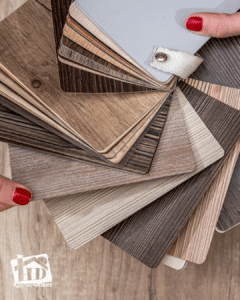
Color Psychology in Home Design
Color plays a powerful role in shaping our emotions, moods, and overall perceptions of a space. Whether we realize it or not, the colors we choose for our homes can influence everything from energy levels to relaxation and even productivity. That’s why understanding color psychology is essential before selecting a color scheme for any room.
According to Verywell Mind, interior designers use color as a therapy tool to promote well-being and enhance daily living. By carefully choosing colors based on their psychological effects, homeowners can create environments that encourage calmness, focus, creativity, or social connection.
For example, soft blues and greens promote serenity and relaxation, making them excellent choices for bedrooms and bathrooms, while warm tones, such as evocative reds and oranges evoke energy and warmth, making them ideal for living rooms and dining spaces. Selecting the right color isn’t just about aesthetics—it’s about crafting an atmosphere that aligns with your lifestyle and needs, such as choosing energizing colors in your cozy home office.
Before starting a home painting project or redesign, it’s important to consider how colors impact mood, energy, and spatial perception. With the right approach, you can harmonize your home and create a space that not only looks great but also feels right.
How Colors Affect Mood and Perception
When choosing colors for your home, it’s essential to consider how they influence mood, energy, and the overall feel of a space. Different colors evoke different emotions, making them more suitable for some rooms than others. Here’s a look at how color psychology can help you create the perfect ambiance in each area of your home.
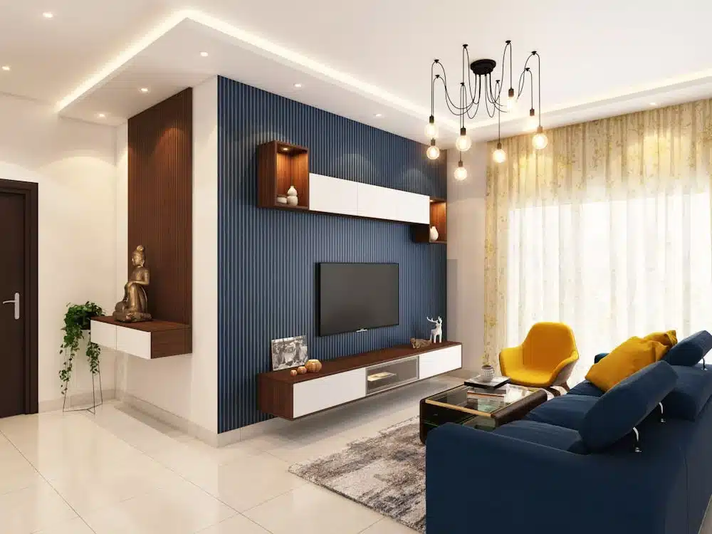
Blue: The Color of Calm and Serenity
Best for: Bedrooms, bathrooms, offices
Blue is one of the most popular colors in interior design due to its calming effect. It’s known to reduce stress, lower blood pressure, and create a sense of tranquility, making it an excellent choice for relaxing spaces.
Psychological Effects:
- Evokes calmness, trust, and relaxation.
- Light blues create a spa-like atmosphere, while deeper blues add sophistication and depth.
- Can help improve focus and productivity, making it ideal for home offices.
Example:
A neutral blue bathroom fosters tranquility and cleanliness, making it feel like a peaceful retreat after a long day.
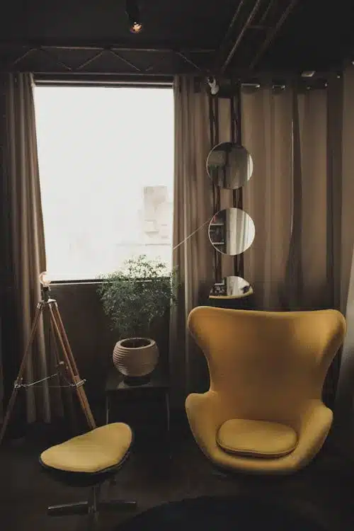
Red: The Color of Energy and Passion
Best for: Home gyms, offices, dining rooms
Red is a powerful, high-energy color that stimulates excitement and passion. It’s best used in rooms where activity and engagement are encouraged. However, because it can be intense, it’s often best applied as an accent color rather than a dominant shade.
Psychological Effects:
- Increases heart rate and energy levels, making it great for spaces where motivation is needed.
- Encourages appetite, making it a popular choice for dining rooms.
- Adds warmth and boldness to any space.
Example:
A red accent wall in a home gym can boost motivation and drive, making workouts more invigorating.
Light Colors: Positivity and Spaciousness
Best for: Small rooms, living areas
Light colors create an open, airy feel and can make small rooms appear larger. They reflect more natural light, brightening a space and promoting a positive, uplifting environment.
Psychological Effects:
- Light colors reflect more light, making rooms feel bigger and airier.
- Soft whites, creams, and pastels evoke optimism and openness.
- Helps create a neutral, versatile backdrop for any home decor style.
Example:
A white-painted living room with natural lighting enhances a bright and welcoming feel, making the space feel more inviting and expansive.
By understanding how color influences mood and perception, you can strategically choose the right shades to enhance comfort, energy, and ambiance in your home. Next, we’ll explore how to select a cohesive color scheme that ensures harmony throughout your space.
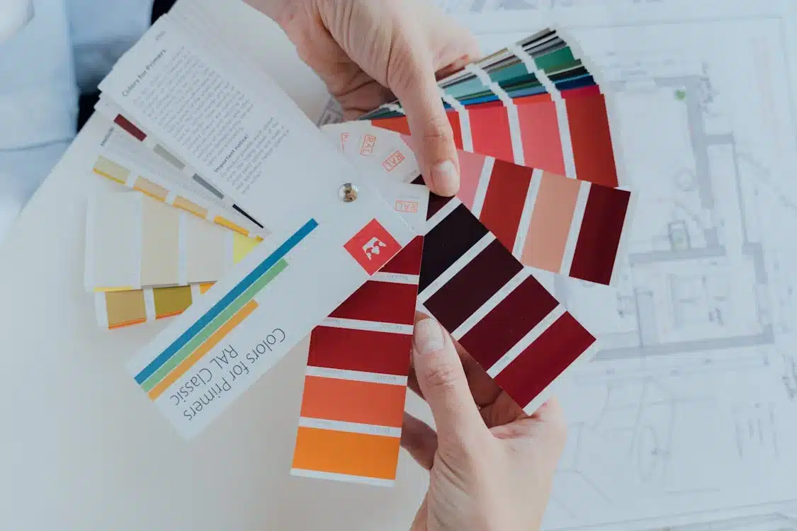
Choosing a Color Scheme for Color Psychology Cohesion
Selecting a cohesive color scheme is key to creating a harmonious and visually appealing home. Whether you prefer a subtle, soothing look or a bold, energetic design, understanding how different color schemes work together can help you make the best choices for your space.
Monochromatic Color Schemes for a Unified Look
What it is:
A monochromatic color scheme is based on a single color, using different shades, tones, and tints to create depth and variety. This approach offers a clean, sophisticated aesthetic that’s easy to style.
Why it Works:
- Creates a calming, elegant, and cohesive atmosphere.
- Works well in small spaces, making them feel more open and organized.
- Allows for easy layering of textures and patterns without feeling overwhelming.
Example:
A neutral beige bedroom with varying shades of brown and cream creates a warm, inviting space while maintaining a simple and modern design.
Analogous Color Schemes for Natural Harmony
What it is:
An analogous color scheme consists of colors next to each other on the color wheel (e.g., blue and green or red and orange). These combinations are often found in nature, making them feel organic and comfortable.
Why it Works:
- Creates a smooth, natural transition between colors.
- Offers a cozy, inviting ambiance without harsh contrasts.
- Works well in living rooms, bedrooms, and kitchens for a soft, relaxing feel.
Example:
A living room with soft green walls and blue accents evokes a peaceful, nature-inspired aesthetic, bringing in the calming elements of earth and sky.
Contrasting Colors for Visual Interest
What it is:
Contrasting or complementary colors are opposites on the color wheel (e.g., blue and orange, red and green). This approach is perfect for adding bold, eye-catching design elements to your home.
Why it Works:
- Creates visual depth and excitement.
- Helps highlight specific areas, like accent walls or architectural details.
- Works well in modern and eclectic spaces, adding personality.
Example:
A neutral blue bathroom with red tile highlights in the backsplash adds bold contrast while maintaining a balanced and sophisticated look.
By selecting a color scheme that aligns with your style and preferences, you can ensure your home feels cohesive, comfortable, and beautifully designed. Next, let’s explore specific color recommendations for each room in your home.
Color Psychology for Each Room
Each room in your home serves a different purpose, and choosing the right color palette can help create an atmosphere that enhances functionality and comfort. Below are recommended colors for key spaces in your home based on color psychology.
Living Room: Warm and Inviting
Best Colors: Reds, oranges, yellows, and neutral tones.
Why:
- These colors promote warmth, energy, and social interaction.
- Reds and oranges encourage conversation and coziness, making them great for entertaining spaces.
- Neutral tones like beige and taupe provide a versatile backdrop that works with various design styles.
Example:
A soft beige or burnt orange living room creates a welcoming environment that feels both sophisticated and inviting.
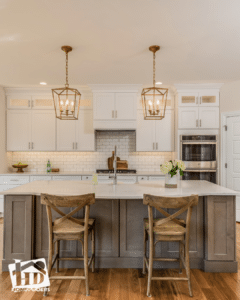
Kitchen: Clean and Modern
Best Colors: Blues, grays, and whites.
Why:
- These colors enhance cleanliness and organization, which are key in a kitchen.
- Cooler tones like blue and gray promote a calm, fresh atmosphere.
- White reflects light, making the space feel larger and brighter.
Example:
A light gray kitchen with white cabinets maintains a sleek, timeless appeal, perfect for both modern and traditional homes.
Bedroom: Calm and Restorative
Best Colors: Lavender, soft pinks, and neutrals.
Why:
- These colors promote relaxation and restful sleep.
- Lavender and soft pinks reduce stress and anxiety, making them ideal for bedroom spaces.
- Neutrals like beige and soft taupe create a cozy, grounding environment.
Example:
A lavender-painted bedroom fosters a tranquil, dreamy escape, making it easier to unwind and get a good night’s sleep.
Bathroom: Fresh and Serene Color Psychology
Best Colors: White, blue, gray, and neutral tones.
Why:
- These shades enhance cleanliness and relaxation.
- White and light grays create a crisp, fresh feel, while blues add a calming spa-like effect.
- Neutral tones blend well with natural materials like stone and wood.
Example:
A white and blue bathroom evokes a spa-like retreat. We are happy to help if you are looking to change the color scheme as part of a bathroom remodel.
By choosing intentional colors for each room, you can create a cohesive, comfortable home that enhances your daily experience. Now, let’s explore how Honey-Doers can help bring your vision to life with expert color selection and home remodeling services.
How Honey-Doers Can Help You Find the Perfect Colors
Choosing the right colors for your home is about more than just aesthetics—it’s about creating a space that feels harmonious, inviting, and aligned with your lifestyle. At Honey-Doers Remodeling, we understand how color psychology impacts mood, functionality, and overall home design.
Why Work with Honey-Doers?
- Expert Color Guidance – We help homeowners select the perfect color schemes based on their preferences and the psychology behind color.
- Customized Home Design – Whether you want a calm retreat, a vibrant workspace, or a warm and inviting living area, we tailor your home’s palette to match your needs.
- Seamless Execution – From painting and accent walls to full home remodels, our team ensures flawless results that enhance the value and beauty of your home.
A well-planned color scheme can transform your space, making it feel balanced, modern, and uniquely yours. Contact Honey-Doers today and let our experts help you bring your home to life with the power of color!